![Rogo logo - full colour without Eintech@2x.png]](https://help-guide.eintech.com/hs-fs/hubfs/Rogo%20eintech%20design%20toolkit/Rogo%20Logos/Rogo%20logo%20-%20full%20colour%20without%20Eintech@2x.png?height=50&name=Rogo%20logo%20-%20full%20colour%20without%20Eintech@2x.png)
Textbox Input Size
You can set the width of the textbox input. When you select Text Box an option will appear, giving you an example for each size. It still defaults to Auto, which will be the width of the container (table cell width or page width if none), but this handy feature makes it much easier to have a smaller box for shorter answers. 
Tip: The size examples allow you to type in an expected answer to help you gauge the required size.
Validation type
For Text Box questions, you can set a validation type which will check if the student has entered an acceptable currency or number format. If not, it will display a Validation Warning message. 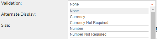 When a validation type ends in ‘Not Required’ then this means that the student doesn’t have to respond to the question to move onto the next, however if you use a validation type without this then the student will be unable to move onto the next question without first responding. Although not normally required, it is recommended you require a response if you have a complex design, to avoid students missing a question.
Alternate display
For TextBox input, you can set the box to right align. This is helpful if it is a currency or numerical answer, this will help in a balance sheet layout.
For Radio Button input you can choose between vertical or horizontal display of the options.
Question notes and draggable divider
 Turning this on gives you the option to add notes to go alongside the question area, used for scenario information, question data etc. Rogo will automatically split the screen and add an adjustable divider. This gives the student flexibility in how they view the question, initially giving space to the notes containing the scenario, then dragging the divider over to give more space for the response, very useful for essay or spreadsheet question types.
Feedback
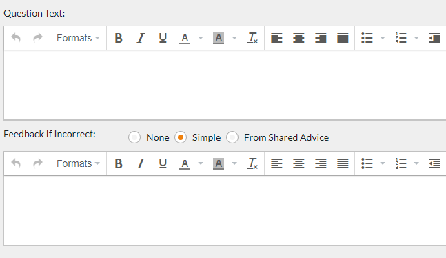
This is the general feedback which can be shared with the student on the results screen, there are two types of feedback, 'Simple' and 'From Shared Advice'.
With simple feedback this would be set up for the individual questions if you wanted to provide them with very specific feedback, if you want more generic feedback which you can use for multiple questions, you can set this up as a piece of shared advice which can then be linked to multiple questions.
Shared advice can be created in the Admin area, by going to System Setup and then System, where you will find a button for 'Feedback Advice' here you can create categories of shared advice and then individual pieces of advice below that.
Question Options
Once you have saved the new question you will be allowed to enter the options/correct answers. For each option, you enter in the marks awarded if the student types/selects it. This allows you to accept different answers/formats and give varying marks for each, for example, if you wanted to accept “non executive” and “non-executive” or rounding 10.5 to 11.
Question Text/Design
 The question text, or question stem, can contain plain text, formatted text, tables, images or additional exhibits.
Custom Layout
By default, the response area is placed underneath the question text. You can however change the layout of the question to Custom which will allow you to design the layout of the question, and the position of the response area.

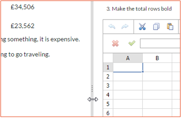
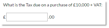 An example would be if you had a Text Box question but wanted to add text before and after the input box, like the example here:
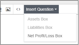 You can design your question by using the WYSIWYG editor, questions are then added to the design by inserting placeholders, to add a question click the Insert Question drop down and then select the question. This will insert the question at the location of the cursor.
Any questions which have already inserted into the design, will be greyed out and you will be unable to select them.
Previewing design
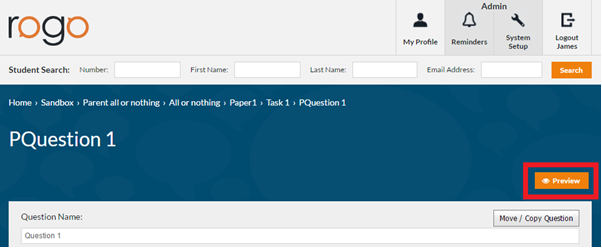
At any time during the design you can preview your changes. At the top of the screen is the Preview button (pictured below). Click Preview, your question will open in a new tab. This allows you to quickly view changes or trial different designs and templates. This does not save your work, to save you need to click the Save button.
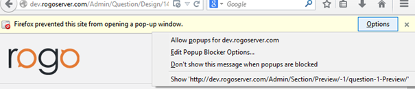
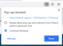
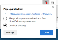
NB: If preview does not load, make sure the popup is not blocked.
Chrome or Edge: Click popup blocked icon in the top right, select Always allow pop-ups and click Finish.
Firefox: Click options top right, select Allow popups, reload page.